
Z-Image Prompt Formula: The 6-Part Universal Template
A practical 6-part prompt formula for Z-Image to generate cleaner, more controllable results—posters with typography, DTC product shots, studio headshots, hero images, and storyboards.
🚀 New here? Read What is Z-Image first for a quick overview.
TL;DR
Use this 6-part structure to get more obedient, cleaner generations: Subject + Scene + Composition + Lighting + Style + Constraints. Copy the template, swap only a few lines, and you’ll get consistent results for posters, ecommerce, headshots, and hero images.
Why most prompts fail (and how this fixes it)
- Prompts are vague (“cinematic”, “high quality”) but lack a shot plan.
- No layout instructions → typography has nowhere to live.
- Weak constraints → extra objects, messy backgrounds, anatomy issues.
This guide upgrades your “Prompt Formula” into a repeatable workflow you can reuse across use cases.
🚀 Try it on z-image.win — Open generator
The 1-line formula
Subject + Scene + Composition + Lighting + Style + Constraints
What each part controls
- Subject: what the image is about (the anchor).
- Scene: where/when/mood (context without clutter).
- Composition: camera + framing + whitespace (control).
- Lighting: realism + commercial polish.
- Style: art direction (pick one “north star”).
- Constraints: rules, typography lock, negatives.
The 6-Part Prompt (deep breakdown)
Each section includes: Purpose → What to include → Good examples → Common mistakes
1. Subject
Purpose
Define the main subject with enough specificity to avoid “generic outputs”.
What to include
- Person/product/object + key attributes (age, materials, color, features)
- Action / expression (optional but helpful)
- Wardrobe/accessories (for people), finish/labeling (for products)
Good examples
- “A 27-year-old woman with copper-red hair, light freckles, neutral glossy lips, subtle eyeliner, calm confident gaze.”
- “A matte black skincare bottle with a minimal label, cylindrical body, clean cap, premium finish.”
Common mistakes
- Too many adjectives with no anchor (“cinematic, stunning, best quality”)
- Conflicting attributes (“silver bottle” + “matte ceramic”)
- Multiple main subjects competing for attention
2. Scene
Purpose
Add context and mood without introducing chaos.
What to include
- Location + time + vibe (1–2 phrases)
- Weather/props only if they serve the story
Good examples
- “Minimal studio set on a warm beige stone slab, clean horizon, calm premium mood.”
- “Boutique cafe corner, soft ambient reflections, lifestyle commercial tone.”
Common mistakes
- Listing 8+ props → clutter
- Competing scenes (“rainy street” + “sunny beach”)
3. Composition
Purpose
This is your “director + designer” control panel: framing, whitespace, typography space.
What to include
- Camera view: straight-on / 3/4 angle / top-down
- Placement: centered / rule-of-thirds / split layout
- Whitespace: where text will go
- Lens + depth: 35/50/85/135mm, shallow DOF
- Aspect ratio: 1:1 / 16:9 / 9:16 / 4:3
Good examples
- “Centered product, wide margins, clean negative space above for headline, straight-on view.”
- “Split layout: subject on left, clean gradient space on right for text.”
Common mistakes
- No whitespace instruction → text crashes into subject
- No camera plan → unpredictable framing
4. Lighting
Purpose
Lighting is what makes images look “expensive”.
What to include
- Key light direction, softness, rim light
- Shadow softness
- Reflections/specular highlights for products
Good examples
- “Soft key light from left, gentle rim light, realistic reflections, soft shadow under the object.”
- “Dramatic side key light from right, subtle fill, crisp cheekbone definition.”
Common mistakes
- Only saying “cinematic lighting” without direction
- Mixing incompatible setups (hard noon sun + studio rim)
5. Style
Purpose
Choose one main art direction (don’t mix five).
What to include
- Photoreal / editorial / minimal product / film look / illustration
- Color grading (cool desaturated, warm beige, high contrast)
- Texture target (skin pores, fabric weave, micro-scratches)
Good examples
- “Premium editorial fashion photography, cool desaturated grading, realistic skin texture.”
- “Clean DTC product hero, minimal studio aesthetic, warm beige palette, high-end finish.”
Common mistakes
- Too many style references at once
- Style that contradicts the use case (e.g. busy cyberpunk for clean ecommerce)
6. Constraints (Rules + Negatives)
Purpose
Force obedience: reduce randomness, stop unwanted artifacts.
What to include
- Hard rules: “ONLY X elements”, “no watermark”, “no logo”
- Typography lock (if text): exact words, placement, font style, readability
- Anatomy constraints: 5 fingers, no extra limbs (for people)
Good examples
- “Constraints: ONLY the bottle and two-line headline, no extra text.”
- “No watermark, no logo, no extra limbs, accurate anatomy, 5 fingers.”
Common mistakes
- A huge negative list that fights your prompt
- Vague constraints (“don’t be messy”) instead of concrete rules
Generate: The universal template
6-Part Universal Template (English/Chinese)
Six-part Prompt Template — Ready to Run
Use the template below as a repeatable production workflow for posters, ecommerce, headshots, and hero images. Click the CTA to try similar prompts in the generator.

1. Subject:
[Describe the main subject with specific attributes, action/expression.]

2. Scene:
[Where it is, time/mood, minimal supporting context.]

3. Composition:
[Camera angle, framing, subject placement, whitespace for text, lens + DOF, aspect ratio.]

4) Lighting:
[Key light direction/softness, rim/fill, reflections, shadows.]

5. Style:
[One main style direction, color grading, texture target.]

6. Constraints:
[Hard rules: ONLY X elements, no watermark/logo, typography lock (exact words + placement), anatomy rules if needed.]
Quick fill guide (change only 3 lines)
- Want a new topic? Change: Subject / Scene / Style
- Want it to be more obedient? Strengthen: Composition / Constraints
- Want “premium” instantly? Improve: Lighting + Materials in Style
5 ready-to-use examples (same structure)
Each example includes: Goal → Prompt → Why it works → 3 Tweaks →Negative
Example 1 — Macro Portrait — Cherry Blossoms

Macro Portrait — Cherry Blossoms
1. Subject:
A hyper-detailed close-up portrait of a young red-haired woman with fair freckled skin, loose curls pinned back by glossy black enamel clips.

2. Scene:
Her face half-veiled by overlapping cherry blossom branches; petals brushing her temple and casting delicate, fluttering shadows over her eyes. Pollen dust sparkles on the petals.

3. Composition:
Portrait composition in a 3:4 vertical frame, extreme close-up / head-and-shoulders with a shallow DOF; subject centered with blossoms framing the face. Nikon Z8 with a 105mm macro lens look; 8K detail.

4. Lighting:
Ethereal backlighting with soft god rays filtering through pink blooms; subtle fill to keep facial detail and gentle rim to separate hair from background.

5. Style:
Intricate photoreal rendering—fine eyelash strands, faint capillaries on eyelids, satin lip balm highlight, micro skin texture, pastel bokeh background with filmic grain.

6. Constraints:
No logos, no text overlays, no extra props. Keep focus on face and blossoms; preserve natural freckles and skin texture, avoid heavy retouching or oversmoothing.- aspectRatio: 3:4
Why it works
- Micro-detail focus: macro lens + 8K instruction directs the model to render high-frequency details (lashes, capillaries, pollen), improving realism.
- Foreground framing: blossoms partially veiling the face add depth and narrative while guiding focus to eyes.
- Controlled lighting: backlighting with soft fill preserves translucency in petals and subtle skin highlights without blowing out details.
3 Tweaks
- Increase aperture emphasis (shallower DOF) to push background further into pastel bokeh and make the subject pop.
- Slightly warm the fill light (+1–2 on warmth) to enhance freckled skin tones without altering the overall pastel mood.
- Add a faint specular catchlight in the eye to increase life and depth.
Negative
- No watermarks, no branding, no text overlays.
- Avoid over-smoothing skin or aggressive denoising (no plastic look).
- Do not add extra props or change hair/accessories; keep the cherry blossom framing intact.
Example 2 — Sci-Fi Noir Poster (Sandstorm Ruins + Mechanical Eye + Orange)
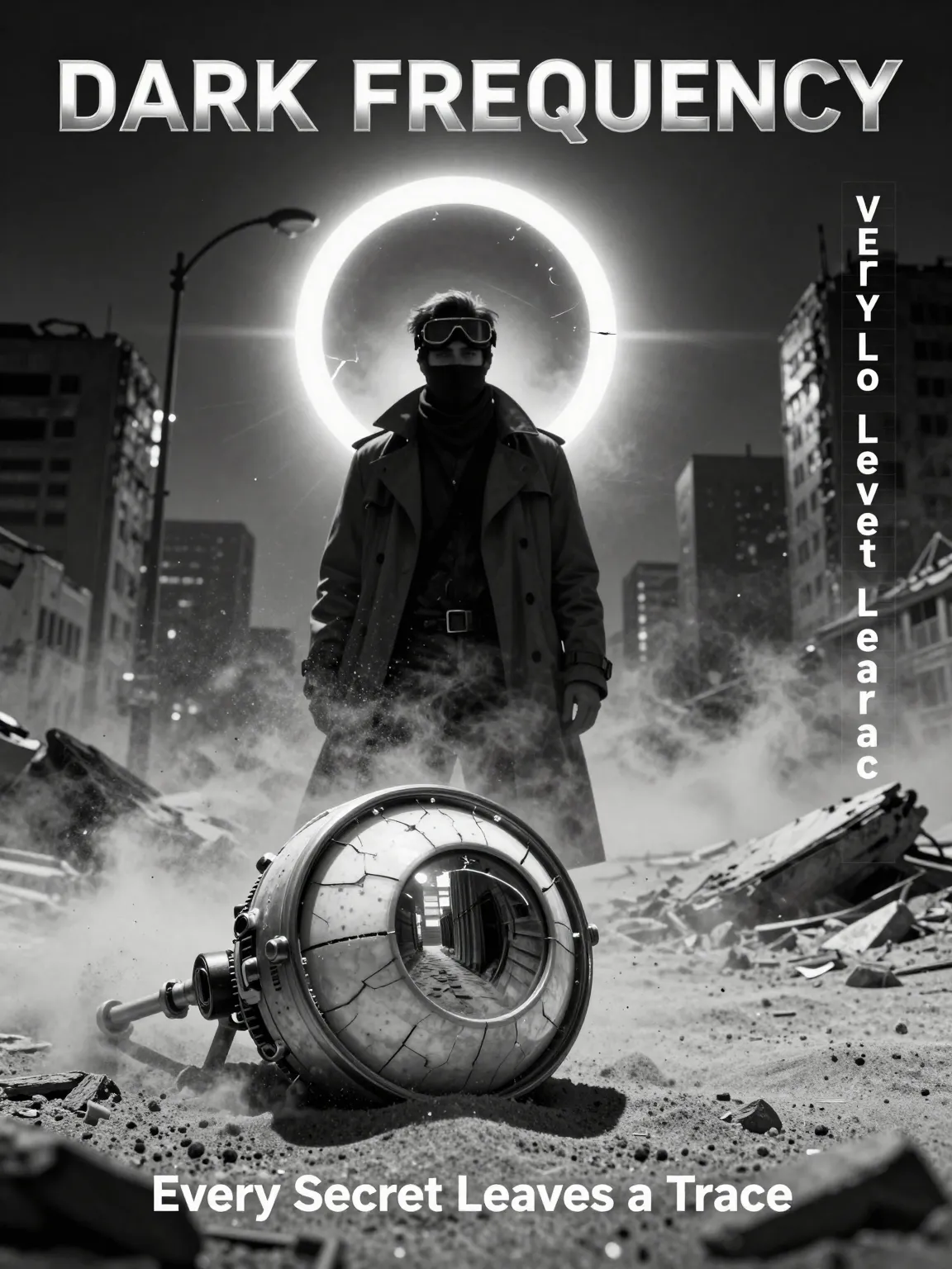
Sci-Fi Noir — Sandstorm Ruins
1. Subject:
Vertical sci-fi noir poster centered on a lone trench-coat investigator — goggles on forehead, scarf over mouth, face partly in shadow; foreground features a cracked mechanical eye (robotic optic sphere) with a reflective lens.

2. Scene:
Sandstorm‑ridden ruins of a collapsed megacity; dust and debris swirl, fractured eclipse halo hovers in sky, particles catch the light and add atmosphere.

3. Composition:
3:4 vertical poster — strong central silhouette framed by the eclipse; mechanical eye in foreground creates a leading line into the scene; right-side vertical credits column aligned to a typographic grid; heavy vignette to focus attention.

4. Lighting:
Hard noir key cutting through dust from one side, deep directional shadows, pronounced rim highlights on coat edges and the mechanical eye’s metal ring; visible particle beams add texture.

5. Style:
Silver‑gelatin monochrome aesthetic with heavy film grain, scratches, subtle halation, and cinematic contrast; 8K detail for crisp foreground elements.

6. Constraints:
Monochrome only except ONE faint orange accent inside the eclipse. No branding, logos, or extra text beyond title/tagline/credits. Accurate anatomy; no extra limbs; no random letters or stray artifacts.- aspectRatio: 3:4
- seeds: null
3 Tweaks
- Make the mechanical eye half-buried, only the lens exposed (keep reflection readable)
- Add a torn warning tape fluttering in the sandstorm (no extra text on it)
- Shift the investigator to a low-angle stance, hand reaching toward the eye
Negative
- No extra text, no random letters, no watermark, no logo, no branding, no clutter
Example 3 — DTC Product Hero (Minimal)
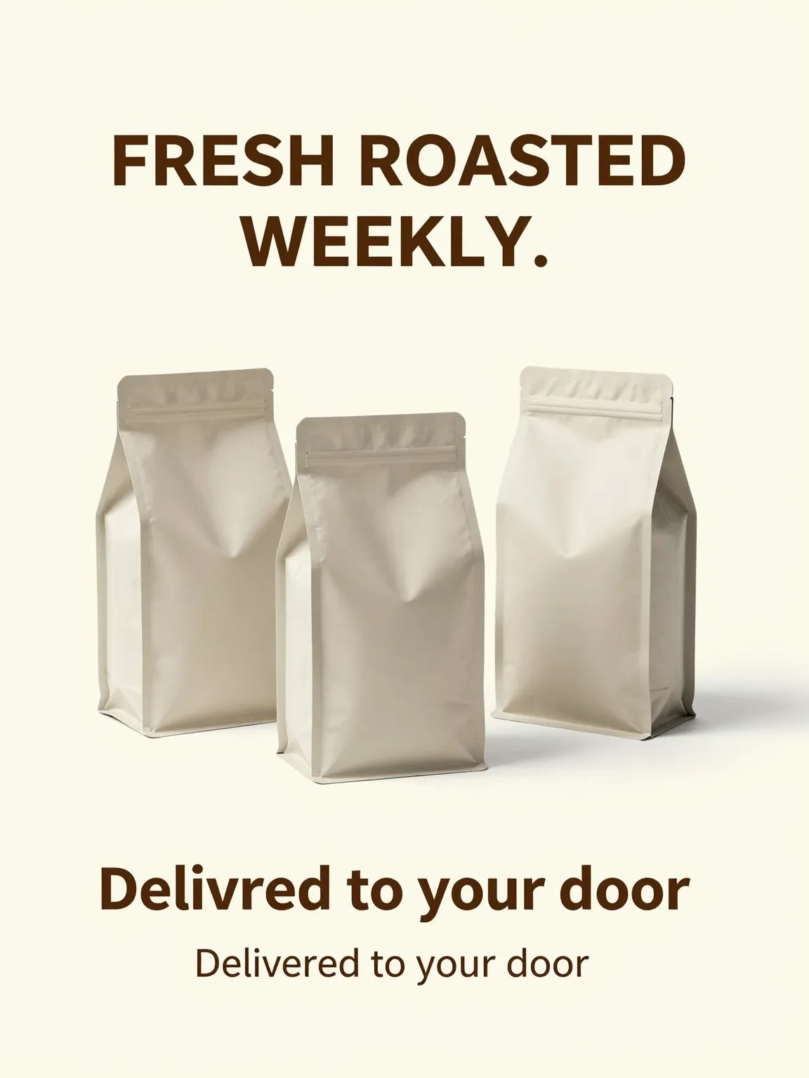
DTC Product Hero — Coffee Subscription
1. Subject:
Clean DTC coffee subscription ad featuring three matte stand-up coffee bags (generic, unbranded).

2. Scene:
Light cream seamless studio background; premium, minimal environment with no distracting props.

3. Composition:
3:4 vertical product hero, centered triangle arrangement of three bags, generous margins, leave bottom 20% empty for CTA overlay (no objects or text in that area).

4. Lighting:
Soft key light with gentle fill and subtle rim highlights on bag edges; realistic soft shadows and clean studio reflections.

5. Style:
Minimal, premium DTC aesthetic with modern typography, subtle film grain, and photorealistic material rendering.

6. Constraints:
No logos, no watermarks, no extra text beyond the two specified lines. No clutter props, no messy reflections, no distorted packaging.- aspectRatio: 3:4
- seeds: null
Why it works
- Classic ad composition: triangle arrangement reads “premium” and keeps attention on the product cluster.
- Built-in conversion space: reserving the bottom 20% prevents collisions with CTA/price overlays later.
- Commercial lighting spec: soft key + rim highlights reliably sells material/edges without ugly glare.
3 Tweaks
- Swap the product to a matte skincare bottle trio (keep the same triangle composition)
- Change background to cool light gray (keep the exact same typography placement)
- Add stronger rim light for a more “premium edge highlight” look (keep shadows soft)
Negative
- No logos, no brand names, no extra text, no watermark, no busy props, no messy reflections, no crooked typography
Example 4 — Studio Headshot (LinkedIn / Founder)
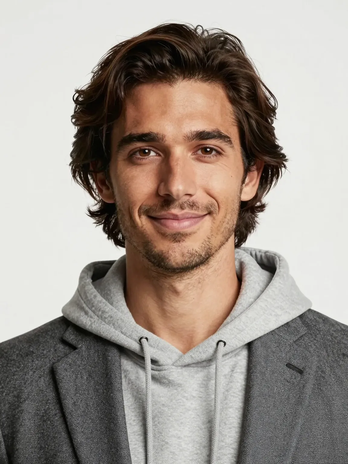
Studio Headshot — Modern Tech Founder
1. Subject:
Modern tech founder portrait — 29-year-old American man with light tan skin, medium-length wavy hair, light stubble, and a friendly confident expression; wearing a hoodie under a blazer.

2. Scene:
Minimal bright studio with a clean seamless backdrop; no clutter or props to distract from the subject.

3. Composition:
3:4 portrait (chest-up to 3/4 body), centered, eye-level framing. 85mm lens look with shallow DOF: subject sharply in focus, background softly blurred.

4. Lighting:
Clean studio key light with gentle fill and soft shadows; add subtle rim/edge light to separate hair and shoulders from background.

5. Style:
Contemporary color grading, ultra-realistic photoreal rendering—fine hair detail, natural skin texture, realistic eyelashes and pores.

6. Constraints:
No logos, no watermarks, no extra props or on-image text. Preserve accurate anatomy (5 fingers), no extra limbs, and avoid digital artifacts or over-retouching.- aspectRatio: 3:4
Why it works
- Focused subject: a single clearly described subject (age, ethnicity, clothing, expression) reduces ambiguity and yields more consistent facial and wardrobe rendering.
- Commercial composition: chest-up framing with an 85mm look and shallow DOF places emphasis on facial features while preserving professional headshot proportions.
- Controlled lighting & style: clean studio key + subtle rim ensures accurate skin tones and separation from background, while contemporary grading keeps results natural and modern.
3 Tweaks
- Increase rim light intensity to emphasize jawline and separate hair from background for stronger profile definition.
- Tighten composition to 1:1 crop (headshot) to create a more intimate LinkedIn-style portrait.
- Add a slight warm tone to color grade (subtle +2–4 on warmth) to improve skin warmth for light tan tones.
Negative
- No watermarks, no logos, no extra props, no text overlays.
- Avoid heavy retouching: no plastic skin, no oversmoothing or excessive sharpening.
- No extra limbs, no duplicated faces, and no random artifacts.
Example 5 — Website Hero

Website Hero — Bento Grid
1. Subject:
Website hero image for z-image.win featuring a top-left Z-image logo (simple Z mark + wordmark), left-side headline "Your Fast Path to Better Images.", subheadline "Generate posters, ads, and hero visuals with precise layout.", and CTA button "Try z-image.win".

2. Scene:
Smooth light gray gradient background; clean, minimal studio-like environment with soft, subtle grain. Right half: bento grid of 5 rounded cards with generic UI icons and tiny preview thumbnails (no brands).

3. Composition:
16:9 hero layout. Left half reserved for logo/headline/subheadline/CTA with generous negative space; right half contains a balanced bento grid (two columns with 3 rows, one cell empty) of rounded cards aligned to a grid. Keep clear margins for responsive cropping.

4. Lighting:
Even soft ambient light with gentle directional key to create soft shadows under cards; subtle vignette to focus attention on left headline zone.

5. Style:
Modern, minimal UI-forward look: crisp typography, consistent spacing, high readability, soft shadows, subtle reflections on cards, photoreal UI thumbnails. Keep color palette neutral with one accent color for CTA.

6. Constraints:
No watermarks, no extra logos or branding except the specified top-left logo. No extra on-image text beyond headline/subheadline/CTA. Ensure CTA text exactly "Try z-image.win". Maintain readable font sizes for mobile crop.- aspectRatio: 16:9
Why it works
- Clear left-right separation (headline + CTA vs visual thumbnails) immediately communicates value and product capability.
- Bento grid previews demonstrate use cases at a glance while the left-side CTA provides a direct conversion path.
- Neutral background with soft shadows and crisp typography keeps visual hierarchy legible across crops and devices.
3 Tweaks
- Swap CTA accent color to high-contrast (e.g., primary orange) to increase click-through visual weight.
- Reduce card count to 4 for mobile-first variants to keep thumbnails legible.
- Increase spacing between headline and subheadline for improved mobile readability.
What to avoid
- No additional marketing badges or third-party logos in the hero.
- Avoid overcrowding the right half with text—thumbnails only.
- Do not use heavy texture or noisy backgrounds that reduce legibility.
Dial knobs (change one thing at a time)
- Lens: 35mm (environment) → 85mm (portrait) → 135mm (tight premium)
- Light: soft studio → side key → rim-heavy highlight
- Material: matte → glossy → metallic/chrome
- Grade: warm beige → cool gray → high contrast
- Layout: centered → rule-of-thirds → split layout
- Typography: 1-line → 2-line → ticket/label layout
Common failures + fixes (patch sentences)
Problem: typography is unreadable / random letters appear
Fix
- “Typography: ONLY these words…”
- “High readability, clean kerning, no extra text”
Problem: too many objects / messy background
Fix
- “ONLY the subject and background, no extra props”
- “Uncluttered background, clean negative space”
Problem: anatomy errors (hands/extra limbs)
Fix
- “Accurate anatomy, 5 fingers each hand, no extra limbs”
- “Natural proportions, realistic joints”
FAQ
Do I need to understand Z-Image first?
Not strictly. But What is Z-Image explains the core capabilities and best use cases.
Do I need a long prompt?
No. You need a structured prompt. Six clear blocks often beat 2000 characters of adjectives.
When should I use negative prompts?
When you see repeat artifacts (extra text, watermarks, anatomy, clutter). Keep negatives concrete.
How do I make text more reliable?
Lock exact words + placement + font style + spacing. Avoid asking for many different fonts in one image.
Next steps
- Try Z-Image Generator
- Explore: Best Prompt Templates Collection
- Use cases: Posters / Ecommerce / Headshots / Hero Images